Save Money by Designing Your Own Promo
Yesterday on social media, I shared a link to a sale going on for DepositPhotos, one of the stock photo sites. I mentioned that I’d picked up that same deal when it was offered last year (and I bought another package this year because I love hoarding never-expire photo credits *smile*).
Those shares led to several conversations on both Facebook and Twitter about how I used those images. For example, the cover models for Treasured Claim and Pure Sacrifice, as well as the basis for the background designs for both of those covers and for Unintended Guardian, all came from DepositPhotos.
(There’s not anything special about DepositPhotos. Other popular stock photo sites, such as Shutterstock, iStock, Bigstock, carry many of the same images. I just happened to have the credits for DepositPhotos.)
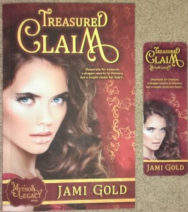
Some of those conversations turned into discussions about my bookmarks, which are starting to make their way into the world. While I paid for a cover designer for my books, I created the bookmarks on my own.
When we compare them side-by-side, however, we can see that they have the same “feel”:
(Newsletter readers: You’ll have to click through to today’s post to see the images.)
Two main questions emerged from those conversations:
- Why did I design my own bookmarks? Easy, to save money.
- How did I design my own bookmarks? Hmm, that requires a longer answer…
Several people then asked me to post about the topic, as saving money is always a good thing. *smile*
Disclaimer #1
I’m not a designer, and I’m sure professionals could do a better job. So this is not a slam against designers and their ability to make a living.
However, authors—especially those without a big publisher budget behind them—have to prioritize where their money goes. For indie authors in particular, many things might be higher priority than paying to have bookmarks or other promo made, such as editing or the cover itself.
Disclaimer #2
Cheaper does not mean without cost. My method cost extra on the front end, but saves me money with every promo item I choose to do myself—for all time.
Got all that? All righty, let’s go…
How to Make Our Own Promo (and Hopefully Save Money in the Process)
Some indie authors design their own book covers, and the latter steps of this post are old hat for them. They already know what they’re doing, and they already have all the pieces and parts to create their own images. Anyone who can handle their own cover can handle a little bookmark. *smile*
This post is mostly for those who are either with a publisher or who pay a designer to create a cover. In other words, this post is for those who would normally get a cover image as the end product and that’s it.
Step #1: Think about Branding and Consistency for Our Book
I use the same avatar across social media so I’m always recognizable as me. In the same way, we want to be as consistent as we can with the branding of our books.
Why? Because as I’ve mentioned before, branding creates better recognition of our work:
Research has found that we remember new items better if we can “attach” those new memories to existing memories. … Context—how brain connections relate to each other—is huge when it comes to branding. One impression creates a hook in our brain used to connect later impressions. The impressions add together to create a sense of the brand.
Let’s take a publishing example. We hear on Twitter about a great new book. Impression #1. Then our friend tells us over lunch about this new book they loved.
If we remember that we’ve already heard about the book, our friend’s recommendation will connect to that first impression and become Impression #2. However, if we don’t remember that we’ve already heard about the book, our friend’s recommendation will stand alone as a new Impression #1.
Which recommendation will stick better in our memory? The connected impressions. Those two impressions will multiply their impact and be stronger than two unconnected impressions.
That’s why companies use shortcuts to trigger memory. That’s why in most cases, authors should use consistent avatars and our books should use consistent covers, tag lines, or blurbs. They’re shortcuts to making sure any impressions about us or our books are connected.
Marketing folk often talk about how it takes X number of impressions before a customer decides to purchase something. If we’re not being consistent, the impressions might never be connected.
Each time a potential reader hears about our book, it might stand alone as a new Impression #1. They might never get to that X number of impressions to decide to buy.
However, if we’re consistent, those impressions are more likely to attach to the previous ones. If there is an X number of impressions that will push a customer to buy, we’re more likely to get there if we keep branding in mind.
Step #2: Analyze the Elements of Our Cover
During the cover design process, we should pay attention to the various elements that make up our cover. In the case of my covers, these elements are:
- Modified Cover Model: Background removed, paranormal eyes, and other touch-ups
- Title: The book title formatted with font, colors, layout, etc.
- Background Image: The background of my covers hints at the paranormal character’s true nature—such as a shapeshifting gryphon, dragon, or unicorn.
- Background Design: The full background with colors, pattern, etc.
- Other: My name font and layout, series branding, colors used, etc.
Many of these elements might be ones we want to duplicate on promotional items, website headers, social media banners, quote teaser images, etc., so we can be consistent. So we want to think about which ones might be good to have for future use.
Step #3: Pay Your Cover Designer to Send You Files of the Elements You Want
I requested the elements I wanted as .png image files. Unlike .jpg (or .jpeg) files, .png files have a transparent background, which means I could layer them over each other without a white box around them.
Yes, this is where the upfront cost comes in. It takes time to put together those files, and this request is above and beyond the normal files sent to clients. So it’s only fair to pay for our designer’s time to send these additional files. (Think of it as a PITA surcharge for being a Pain In The A**. *grin*)
If we’re with a publisher, we might not be able to get these files. But if we explain our plan for consistent branding and promotion, they might cooperate. (Heck, give them the link to this post if it would help. *smile*)
If we’re an indie author, our designer should be willing to send the files if we offer to pay for their time. Either way, it doesn’t hurt to ask.
Step #4: Decide on an Image Program
I don’t have a specific recommendation for a program. The program I use is ancient and barely works on my computer, but it’s the program I know, so I stick with it. *shrug*
Some might go fancy and use PhotoShop, others might use a free program. Free options I know off the top of my head are Gimp, PicMonkey (or use this PicMonkey link to get a free day of their Royale benefits), and Canva. I even know some people who use Microsoft’s PowerPoint and then Select All and do a right-click Save as Picture when they’ve gotten everything how they want.
I haven’t used Gimp or Canva, so I’m not sure what they’re capable of. Here’s my post with my experience with PicMonkey, as well as the guest blog post I did for Writers Helping Writers about PicMonkey.
The main features I used when creating my promo items were overlays (layering one image over another, sometimes with different levels of transparency) and the ability to pick specific colors.
Step #5: Plan Our Promotional Items with a Focus on Consistency
So we already know that consistency helps build our brand. What does that mean for our promotional items?
Think in terms of reusing visuals, fonts, layouts (how things are lined up), colors, etc. Every time our book title appears in an image, we should use the same font and layout (and maybe color if appropriate), etc. Here are several examples of how I reused elements for promotional items and the book interior.
The quote teaser promo images I designed have many of the same elements as the book cover or interior:
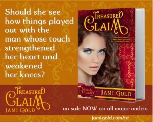

The font of the quote itself is the same font as my chapter headings. The dragon background pattern and cover model are the same as on the cover, the title and my name are the same layout, etc. (And I have to give credit to my friend Angela Quarles, who helped me out with these on my first book and came up with many of the initial ideas. *smile*)
The chapter divider design in the interior uses the same background dragon image:
![]()
That same divider design and title layout show up on the Treasured Claim webpage as well. The series branding elements show up all over my site here, from the header to my home page, as well as on my social media banners, like Facebook and Twitter.
The title page in the interior uses the same title layout and series branding:
The same title and series layout is on the top of the bookmark, and the rest of the bookmark uses the same images for the cover model and background:
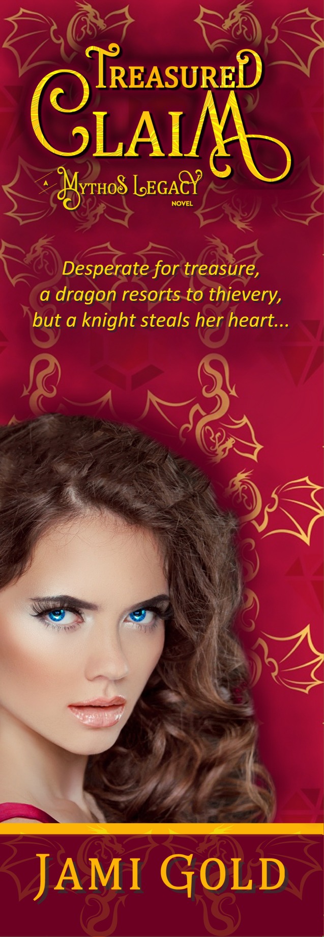
The series name element appears on the back of the bookmark with a thumbnail of the actual cover, and a subtle grayed-out version of the dragon design adds texture as well (click these bookmark images to see larger versions):

What does that all add up to? A consistent image of the book that helps readers recognize the story, creates a sense of a brand, and helps my work look professional.
Step #6: Create Promotional Images
So we have our elements, we have our program, and we have our branding plan. Now it’s just a matter of putting the pieces together.
Remember these keys:
- Make things look connected.
Although I didn’t exactly duplicate the ribbon where my name is on the cover, I hinted at that element on both the quote teaser images and on the front of the bookmark.
I asked my designer for the Hex color names of my cover’s background, text, and badge and ribbon. So I was able to use those colors (or complements of those colors) on the promo items.
The purple for my name on the back of the bookmark is the same color I use here on my site. In other words, that’s my branding, rather than my book’s branding. But the font matches my name on the book cover.
Make things look similar enough that they act as echoes for other impressions.
- Include an “action item.”
Have a plan. How will people who come across our promotional items be able to take the next step?
99% of the promo images for books I see on Facebook don’t include a link for where to purchase or learn more. The authors usually include those links in text above the image, but what if the image is shared or forwarded or otherwise separated from the text?
On a physical item like a bookmark, use a QR code. QR codes can be scanned from a smart phone and take people to a link. I have mine directed to my Books page, but I also have my website address printed alongside the code in case people don’t have a smart phone.
Our promotion should be self-contained to help potential readers find us and our work, no matter how it’s shared.
Take Ownership of Our Book’s Brand
Whether we decide to do the work ourselves or not, we’ll have the freedom to choose if we take ownership of our book’s brand. That means getting our hands onto those element files if we can.
With those files, we’re not locked in to using the same designer to do everything for us. I know of one very popular cover designer who does great work on covers, but who comes up with boring and blah bookmarks.
So it’s good to have the ability to choose. Even if we find someone cheap on Fiverr to create quick promotional images for us, we’re still probably going to need those files with all the elements. (Or if we have the original layered Photoshop file, we might be able to pay someone else to create files of the elements we want.)
Also, no matter what we decide, we want to make sure there is a branding plan. If we go with various resources for different promotional items, our plan will help keep everyone doing consistent work for our overall brand.
But for me, until I’m making a lot more than I am now, it’s best to do the work myself. If I’d paid someone to create those quote teasers, social media banners, bookmarks, and book interior images, I would have less money to pay for editing or something else.
A quick check of one designer added up to $400 for all of those items. That’s a lot of money I’d rather be using for something I can’t do on my own. *smile*
Have you noticed any books with good branding? What made them stand out? Have you created your own promotional items before? Did you have branding or consistency in mind? Do you disagree with any of my suggestions? Do you have any additional tips or suggestions?
Pin It
I have truly, truly missed this!!!
After nearly 8 months of working two jobs, crazy stress and no writing I’ve gotten my self a new job. I’m now working from home and I have so much more free time. It’s amazing.
I’ve missed your wisdom and teaching, but now I’m going to get back into the swing of writing and visit you more often.
This post was MAGICAL! So informative, so chocked full of great suggestions. I loved every word. Especially since I want to make my own cover for a novel that my agent just couldn’t sell. I’m going to self pub that one and this will help immensely!
Thank you so much!!
Tammara
Hi Tamara,
*hugs* It’s so good to “see” you! 😀 I’ll keep my fingers crossed that this new job works out well for you.
Let me know if you have any questions. I’ve done a couple of other self-pub oriented posts since taking the plunge myself, but I haven’t wanted to do too many or else it would upset the balance of posts here on my blog. (And I don’t want it to become a resource only for self-pubbers. 😉 ) That said, if you have any questions, just let me know! *more hugs* Thanks for stopping by!
In other words, basic branding/advertisement advice: be consistent! 😀
I study/work in advertising, so these posts are old news to me, but I really appreciate how you manage to work those stuff into the world of writing, and make them accessible to peeps worldwide. 🙂
Hi Lost-chan,
LOL! Exactly! I need to get you to write my posts for me so I can save a bunch of words (and avoid the late nights working on these posts). 😉 Thanks for confirming my experience!
LOL, maybe someday. I’d love to give some advertising tips — a way to give back to all the help you gave us, I suppose. 😀
Hi Lost-chan,
LOL! Well, many authors find advertising to be ineffective, so if you ever gather any tips that would help authors make their advertising more effective (placement, style, guidelines to look for, etc.), we’d be eager for your advice. 🙂
Great post, Jami!
Thanks for sharing your experiences and wisdom with us.
I nabbed the DepositPhotos promo today myself. Thanks for the recommendation.
Now the issue is, for me, to stay consistent with my branding across my platform. I love the examples you provided.
I’ve used Gimp, and while there’s a steep learning curve, it’s free.
Hi Paula,
Good to know about Gimp. I think I opened it once but closed it right away because I didn’t have time to figure it out. LOL!
I’m glad the examples helped. 🙂 Thanks for the comment!
Oh interesting idea of keeping things consistent across books. But what if your books are of different genres? E.g. fantasy vs sci fi vs horror? (No, I’m not brave enough to write horror; that was just an example, hahaha!) I’ve been reading Derek Murphy’s tips on designing covers, and I see that different genres have different design conventions, e.g. different fonts. Maybe we could have similar layouts, though if it’s not a unique layout, it might not be a “brand”. As for keeping the same type of design, lol, I’m not this far in yet, but I doubt I’d be able to commit to one type of design for all the books I’ll ever publish, but we will see. However, I believe I can stick to SOME similarities for all the books in the same series. So far, there are two series I’m working on, each with many more than three books, haha, so the consistencies should hopefully be noticeable enough. ^^” Oh one cool thing that Derek Murphy pointed out, is that you could even design your own unique font for your story, like Harry Potter has that special lightning bolt font, and Twilight a special font with hooks. That would definitely help create some kind of brand, but I don’t know how costly it would be to design a new font! (Or maybe they just modify the word shapes on Photoshop if they have the license to modify them.) Btw, I thought of some things about cover design… — Read More »
Hi Serena,
I had a whole big comment typed out to answer your question, and then I lost it. 🙁
Suffice it to say that this advice to be consistent applies only to making the promo for a book “match” or echo the book itself. (Books in a series should also have common branding elements, but that’s a different issue.)
For unrelated books, especially when in different series or genres, the most we’d want to have in common is the font and style of our name. And depending on how different the genres are, maybe not even that. So, no, this isn’t about trying to be consistent across every book we write–ever. 😀
To answer your question about illustration or photography, yes, it greatly depends on the genre. Middle grade still uses a lot of illustration. Some genres are a mix. So before deciding which way to go, we’d want to look at several recent books in our genre with both styles and see if the style of the writing, characters, or premise is also different.
In some genres, an illustrated cover can lead to different reader expectations than a photographic cover. And we might want to choose the style that matches what readers will find inside. 🙂 I hope that helps! (And stupid fingers for losing the bigger comment–LOL!) Thanks for the great questions!
Love this post! Very informative and helpful. I really want to take a Photoshop class later this year so I can make more promotional things myself and, in turn, offer that service to my clients. 🙂
Hi Tamar,
Yes, I often think about how much easier things would be if I knew (and owned–LOL!) Photoshop. For one, even if I had someone else design the cover, I could still pull off the layers and save all the files I want myself. 🙂 But no, I have neither the program or the time to learn it. *sigh*
I think this would be a great match for your skills though! 🙂 Thanks for the comment!
I’m a Photoshop user – more or less self-taught – but I’ve heard that Photoshop Elements has an easier learning curve than Photoshop and can do many of the same things. Also, it’s cheaper 🙂 Much cheaper.
I wonder about bookmarks and if they are really useful – mainly because I’ve never bought a book based on a bookmark I got at the library or a con grab bag or wherever. But I like that idea about the code. I don’t have a smartphone so I don’t think about those things 🙂
What is the font on your book covers? It fits your genre well. And speaking of fonts, there are free tools online that can turn your handwriting and anything else like icons, into fonts. So Serena, you can create your own unique fonts. 🙂
Hi Col,
Good to know! My current cover designer (Melinda VanLone) just told me the same thing about PS Elements and wants me to get it so I don’t even have to pay her to pull out these png files (as I’d be able to do it myself). 😀
I know what you mean about bookmarks. I rarely look at them when they’re just thrown into the bottom of a conference bag. I only look at them if *I* choose to pick it up.
For me, they were a cheap thing to have around (just paying for the printing), and I’m mostly using them to give away with physical books. I give a few with each book, so if the reader likes the book, they’ll have one to keep and a couple of others to give away if they want to recommend the book to a friend. 😉
The title font is a mix of two different fonts, but the swirly one you’re probably referring to is Wallington. I liked it because it looked both romance and fantasy–like my books. LOL! And that’s very cool about creating your own font. 🙂 Thanks for sharing!
Two fonts? They look good together. I’m second-guessing myself on the font for my book covers – Kleymissky – because I want something a little more formal and Trajan-like, but with a bit of swash for my historicals. I’ve been scouring font sites for the perfect font. Thanks for the idea!
Hi Col,
LOL! Yep, I’ve spent days looking at fonts too. 🙂 That font is actually one my designer suggested. It’s a finicky font that doesn’t work in the usual way, but I let my designer worry about that. Good luck, and thanks for the comment!
I should have got all the information files from my original cover designer, especially for promo. He doesn’t do covers much anymore and book three will be difficult to match up (fortunately I got book two done ages ago) though the file would have been Photoshop, which I don’t use. I design my own covers now, so this won’t be so much of a problem. But I’m no designer, not like the one I originally hired, so I can’t replicate what he did.
One site I’d like to add here for readers, which helps enormously in the design of promo pics and covers, is Canva.com. It’s free and incredibly easy to use, with templates. 🙂
shahwharton.com
Hi Shah,
That’s a good point. Another reason it helps to have all the files we can get–especially of the original layered Photoshop file–is so that we’ve covered should anything happen to our designer or our working relationship with them.
Some designers will charge extra to provide the Photoshop file, but that’s the minimum we should get. At least with that file, we can find a way to get everything else we need, and if we need to switch designers mid-series, that will give any new designer something to work with for matching.
Yes, I have Canva in the list on Step 4, but I haven’t used it before. Thanks for sharing your experience and insights! 🙂
[…] Save Money by Designing Your Own Promo from Jami Gold. I’ve made my own and gotten files from my publisher to try to use components for book trailers, etc. There are definitely benefits and pitfalls. […]
[…] save money by doing my own promo images and bookmarks and print formatting. For those, I use programs I’m already familiar with, so I didn’t […]