How Should We Format Non-Verbal Communication?

The last few weeks have been hard for many. Between COVID deaths and ongoing pandemic issues, George Floyd’s murder, and the escalating behavior of too many of those in power, it’s likely most of us are struggling in one way or another.
Before I get into today’s topic, I just want to wish love and support to all those fighting injustice with the protests. Black lives do matter. *hugs to you all*
Personally, I’ve been dealing with another medical setback, as I fell down the stairs the other week (near the bottom, so only 2 steps at least *sigh*). My injuries weren’t too bad immediately, but over the following week, the swelling from the worst bruise caused a flare-up in the damaged nerves of my feet. Cue being unable to walk for over a week and needing to schedule a medical procedure mid-pandemic. Joy! Hopefully, this procedure will make my feet better soon. *fingers crossed*
A few months ago, we talked about how to format dialogue, and we later followed that up with how to format character interiority. In that latter post, as the default formatting for a character’s direct internal thoughts is to use italics, we briefly touched on the issue of how to avoid using too many italics in our stories if we have non-verbal communication, such as if our story includes telepathy.
Let’s dig into that specific situation a bit more to also talk about text messages and explore some of our options for how to format non-verbal communication passages in our story.
Before Deciding on a Formatting Option…
In the wider world, we have many formatting options to express ourselves when writing emails or blog posts like this one. However, if we’ve been around the fiction-writing block for a while (or paid attention to fiction publishing standards), we might have noticed that we don’t use all the tools at our disposal when it comes to formatting within fiction.
In the fiction-writing world, it’s extremely rare to see:
- bold
- underlining
- mixed fonts or sizes or colors
- all caps
And so on. In other words, for the most part, italics are the only “unusual” formatting commonly used in traditional fiction publishing. All those other options are often seen as unprofessional at the least and potentially causing problems with publishing at the worst.
That’s a huge reason that italics are so easily overused. Even just the industry standard uses of italics for emphasis, direct internal thoughts, and non-English words can add up to a lot of italics, which can be hard to read. But branching out too much can cause problems as well.
Especially with the growth of ebooks, many types of unusual formatting are to be avoided because they often won’t translate well to an ebook format. For example, many ereaders will only use their internal font, so any font changes (including size or typeface) we make to our story will simply be ignored unless we code our ebook file a certain way (and sometimes not even then).
However, we can find options that will translate to ebook formats. And hopefully at the same time, we can ensure our writing still looks professional. *smile*
Tip #1: Avoid Using Unusual Formatting for Character Emotions
In fiction writing, all those bullet points mentioned above are most frowned on when being used for emphasis of a character’s emotions. As writers, we’re supposed to use our words and deep point of view (POV) and showing how our characters feel rather than relying on formatting (or even punctuation) to carry the heavy weight of their emotions.
How can we format non-verbal communication without distracting readers? Click To TweetIn fact, many editors, agents, and others in fiction publishing frown on too many exclamation points in a story. Any more than three over the course of a whole novel is often seen as questionable.
So of course using bold or underlining or all caps, just for emphasizing a character’s emotions, is seen as a cheap and lazy writing shortcut. Instead, we should be digging deeper into our character and their experience.
All that said, I have seen a handful of books that used all caps for emphasizing a whole sentence of a character’s dialogue—not just a single word—but generally only once in the story. And as I’ll get into below, I’ve seen bold used for unusual passages.
Tip #2: Be Consistent with Our Choice
The most important tip for whatever formatting we choose for our story is be consistent. Whatever format we choose for our unusual passages, we should make sure the first instance is clear and then stick with that same formatting throughout the story.
For example, if we decide to use quote marks and italics for telepathy, we need to make sure readers understand that the first passage is telepathic and then keep the same italics and quotes formatting for the rest of the story. That way, readers won’t have to re-figure out our personal approach with every instance of telepathy in the story.
Example #1: Telepathy, Signing, and Other Non-Verbal Communications
As I mentioned in my earlier post, although italics is the default for telepathy:
“There’s no one “right” way to indicate telepathy (and differentiate from direct internalizations) to readers, especially as each story might have special considerations.”
For example, in my Stone-Cold Heart novel, I used italics, no quotation marks, and small caps for the telepathic “language” of boulders. For this story’s circumstances, I wanted to match the grating “voice” of stone and avoid quotation marks, as they don’t use words, so the “dialogue” is just an approximation of their communication.
We can run into similar issues with sign language, augmentative and alternative communication devices (AAC devices), or any other non-standard communication that takes place between characters. In these cases, we might want to use formatting to ensure the reader knows the dialogue isn’t standard speech, or that the dialogue is a translation due to grammar differences, etc.
Here are a few formatting options for non-verbal communications:
- italics with quotation marks
- italics, no quotation marks, and communication-method-specific dialogue tags (she asked telepathically…)
- no italics, quotation marks, and communication-method-specific dialogue tags (she signed…)
- single quote marks, but only when also combined with italics and/or communication-method-specific dialogue tags (the single marks alone often won’t be noticed or they’ll be thought a typo (or might confuse British readers))
- leading em-dash for non-standard dialogue passages (with or without quote marks)
“What do you think?”
—I like it! - leading or surrounding the communication passages with specific formatting, such as:
- a double colon ::passage::
- square brackets [passage]
- angle brackets (single or double) <passage> or <<passage>>
- guillemets (used as quote marks in some languages) «passage»
- parentheses (passage)
- asterisks *passage*
- slashes /passage/
Example #2: Texting and Other Unique Communication Methods
In contemporary or futuristic genres, our stories might include texting, conversations with AI devices (such as an Alexa), and the like that involve unique circumstances. For example, to mimic the format of our texting apps, we might want to use certain formatting that will bring readers deeper into the POV of our character.
Once again, there are no set rules for how to format these passages. But of course, with whatever we decide, we should be consistent.
Note that many of the options below include formatting with indenting. Depending on how the indenting is coded, ebook formatting might not pick up the indents. In general, using styles for these sections is preferred for ensuring consistency, rather than specifying the formatting line-by-line—and definitely don’t just use spaces or tabs. Also, note that many of the example images show a line break between the messages, which might help keep the texting nature and changes of speakers clear if the ebook formatting messes with the indenting.
Here are a few formatting options for text messages:
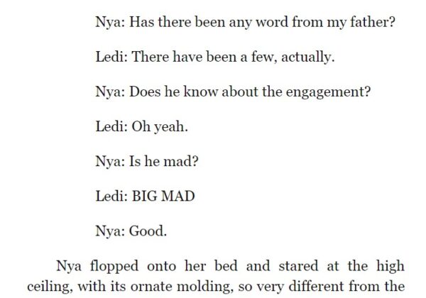
- Indent text messages from the left margin and put names before each, like in the example image from Alyssa Cole’s A Prince on Paper (newsletter readers, click through to the post to see the images):

- Indent text messages from the left margin and make one side of the conversation left aligned and the other side of the conversation right aligned. For short exchanges, this format might not need name labels, but for longer exchanges, name labels should be added at the beginning of each line:
Bob: Ready to head to the stars?
Doug: You know it!
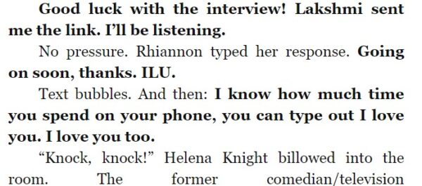
- Indent text messages from the left margin and use bold for one speaker’s words, such as this example from Alyssa Cole’s A Princess in Theory (again, for longer exchanges, we’d probably still want to include name labels):

- In addition to indenting from the left, we can also use hanging indents (where the second and following lines are indented even further) to make the leading name label stand out and emphasize the difference from the usual formatting, such as this example from Alyssa Cole’s A Duke by Default (Why yes, I love Alyssa’s whole series, can you tell? *grin*):

- Especially for short passages, we could use normal paragraph formatting, but bold the text messages, such as this example from Alisha Rai’s The Right Swipe:

- Again for short passages, we could use normal paragraph formatting, but separate the text message on its own line and use small caps.
- Indent from both the left and right margins, much as authors often format letters or news articles.
- Use leading formatting characters before the text message:
>>Sue: Are you sure?
With an Alexa or similar device, our character’s dialogue could be formatted normally (but using the “wake” word) and then:
- The AI response could be formatted like normal dialogue.
- The AI response could be set off by a formatting symbol (like from the list in the section above).
- The AI response could be formatted like a text message with one of the options above:
Alexa: I’m sorry. I can’t help you with that.
Final Thoughts
How should we decide?
- We can ask ourselves if one method stands out as being a good match for our story and its special circumstances, including the length and frequency of our passages.
- What readers are used to in one genre might be different from what they’re used to in another genre, so we can research what other stories in our genre have done.
- We can ask readers in our genre what they’ve seen or what would seem normal to them.
- We can rely on beta reader and editor feedback to let us know if our choice stands out in a bad way.
As I mentioned above, with whatever we choose, we should make the context of the first instance clear and then be consistent with our formatting throughout the rest of the story. In general, odd formatting or punctuation can distract readers, but for special circumstances, it might be just what we need to keep readers in our story. *smile*
Have you ever written unusual communications? Did you struggle with how to format the passages? What did you decide? Does this post give you a few more ideas? Do you have any suggestions to add to the lists?
Pin It
Jami,
So sorry to hear about your medical setback!
I shared back in March what I did for a strange communication sequence (dream-like communication between a god and a higher power above the god). In one of the SFF pieces I wrote, one person was using a ‘pad’ to communicate because his tongue had been removed (pirates are evil like that). But my initial critiques revealed the reader often struggled with the scenes that character ‘spoke’ in.
As for your suggested marks, I am kinda excited! (That’s #2 *wink*) I’ve seen guillemets before but had no idea what the name of the mark was. Why is that exciting? Was it just a cheap shot to use another exclamation point? Nope, I just love learning new words. Actually, my real reason is that I really like the look of them for telepathic communication. And since my Canis Shifters in my current work will have varying degrees of it, the timing is most fortuitous. 🙂
Hmm. Ordinarily, I’d have used three exclamation points in the first paragraph. Darn! *giggles* Yeah, I’m a rule breaker. I hope you’re feeling better soon. 🙂
Anne
Hi Anne,
Oh yeah, my emails (just like my replies here) are full of exclamation points. LOL!
And yes, I really like the guillemets too, especially as they are valid quotation marks. 😉 (Those were probably my favorite on the list.) Thanks for the good wishes too!
Thanks Jami, sorry to hear of your fall. I hope you are well again soon.
I dislike the overuse of exclamation marks or italics. I generally don’t read long passages in italics (or text-speak) as they are hard on the eyes, so you especially don’t want to let a conversation run on for pages of alternate text.
The text messages can sometimes be shown in a different font size or typeface. Usually a plainer one so it looks mechanical. Most e-readers will allow the most commonly used typefaces so if the story is in Arial or Helvetica the text could be in Times New Roman.
Heinlen’s Time For The Stars was the first book in which I read telepathy. I knew something was up because the format changed although the character initially thought he was having a normal conversation. That worked nicely but lines were kept short,
Hi Clare,
Yes, I’ve run into that too-many-italics issue before, even with phone conversations. When formatting the dialogue of the remote character, some writers might think to put them in italics, but that’s not necessary — and leads to far too many italics to be easy to read. As long as the context is clear, such as it being a phone conversation, we often don’t need to play with tricky formatting as much as we might think.
And thanks for digging deeper into the issue of switching fonts. (I hope I didn’t imply that I’m against the idea, as in fact, I’ve used different fonts for text messages and the like. 😉 )
I probably should have made this more clear in the post, but if we want to switch fonts, we just need to prepare for ereader difficulties. That might mean that we do more coding and/or testing on our ebook file, or it might mean that we also add more formatting–such as indenting, line spacing, or using small caps–that will make the passage clear, even if the font formatting doesn’t carry through. Thanks so much for adding your insights so I could clarify that point! 😀
So sorry to hear about your mishap! It’s a good thing it was only a couple of stairs. My biggest fear is hurting myself when I’m the only one home (which before the coronavirus was a lot).
I struggled with this when I wanted to include the words from a book my character was reading. I’m so glad I stuck to italics with no quotation marks. I generally use italics as my go-to for unusual formatting because its the one that doesn’t jar me out of the story when I read it in someone else’s writing. The only other one you mentioned that I like is the text formatting with the indent, name of sender, colon, and text information. You’re a well of great information. Thanks!
Had the problem of foreign terms in italics, the protagonist’s prayers in italics, and his internal thoughts, plus the regular dialogue in quotes. Used the quotation marks for the dialogue. Left the foreign words and the prayers in italics, but summarized his thoughts in the text, e.g.: Had he deceived himself? Sure it would be embarrassing to meet her again. That (italics) spalpeen of a brother was probably in China by now. So far beta readers don’t seem confused.