Secret Project: A New Website!
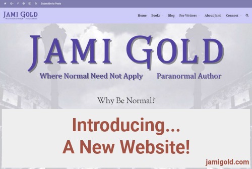
A few weeks ago, I hinted that I’ve been busy working on a secret project. If you’re visiting this post online, you can see the evidence of that project right here: a brand-spanking-new website! Shiny!
(And if you’re reading this via newsletter or feed, check out the new digs!)
My old design was woefully out of date, as I’d had the same design with just minor changes and new content for the full seven years that I’ve been blogging. Yeeks!
Not only was the design dated, but the theme I’d been using was becoming less safe, with only a couple of minor updates over the years. I worried it was only a matter of time until it was a security risk.
Worse, the mobile site was a kludge tacked on behind the scenes. And when every theme and their brother was responsive for tablets and phones except for mine, I knew I needed a change.
Although I still liked my unique background, I longed for a site that was better for readability. I wanted my home page to better spotlight my books and have a more professional feel, etc., etc.
The Work behind the Secret Project
At the beginning of May, my TechGuy Jay set up a “sandbox” site for me to experiment with. He cloned my old site, so I could see every change with my current posts, comments, etc.
I then started to play with a new WordPress theme that looked promising. I picked up the Pro and DevKit extensions for it at a super discount through an AppSumo deal. (The deal has since expired, but that site also runs stock photo deals, so if you like those kind of things, you might want to sign up for their newsletter.)
But with my latest book release (for Stone-Cold Heart) just a week later, progress on the project was slow. For every one issue I’d fix, I’d discover 5 more issues to add to my list.
Like with many other aspects of my past year, I stopped trying to set deadlines for myself, as the stress aggravated my health problems. So any potential switch-over seemed far away.
Yet over the next two months, I slowly made progress on building a new site that was:
- responsive to the different screen sizes of tablets and phones
- easier to read with a cleaner background
- greatly expanded for highlighting my published work
- more up-to-date and professional in design
The Unintentional “Deadline”
By last week, I’d completed design work on an entirely new site from the ground up:
- new Home page
- new pages for all my books and reader-focused stuff
- new footer
- new header
- new backgrounds
- new menus
- new Comment System!!! (I’m so excited about this, I’m going to do a whole post on Thursday about it!)
- new behind-the-scenes stuff (custom programming and swapping out a third of my old plugins for new ones)
This past weekend, I was “testing” how I could roll out my new site—at some undetermined future date—without losing any post-cloning posts or comments. The data resulting from merging my new website structure with the new content at my old site (that had been added since the May cloning step) needed a lot of clean up.
By the time I finished with that cleaning, I checked my remaining to-do list and decided that the site was close enough to “done.” I certainly didn’t want to go through that cleaning process a second time a week or so from now when things were done-done. *smile*
So Jay and I switched my sandbox site to live Saturday night, and I’ve been playing whack-a-mole with the last-minute issues ever since. Please let me know through my Contact Form if you encounter any remaining “moles.” *grin*
The Same…But Different
Unintentionally, the colors of my old site became a major part of my online brand. I heard from many readers over the years who recognized when they landed on my site just because of those unique colors (which were simply a color palette built off my old site’s background—nothing I’d meant to do *shh*).
So when working on my redesign, I aimed for a look that was the phrase we often hear from agents and publishers: I wanted the same but different. *smile*
Obviously, just to get away from the dated design, I needed to make a lot of changes. Add to that the new theme platform, which forced me to rebuild everything, and I knew I had the different down pat.
But I also wanted my site to feel like my site. I decided that it wasn’t about the layout, the background, the header, etc. It was about the colors. Those needed to stay the same.
Sunday night, longtime visitor Sieran commented:
“Wow, Jami, the look of your website has changed!? Or is it just displaying differently on my university library’s computer?”
I’m hoping that uncertainty means I did a good job of still making this place feel like “home.” Plus, it’s so pretty! *grin*
Let Me Squee a Minute…
As I said seven years ago, I’m not a website designer, but I love being able to make everything just how I want it. So I wrote custom CSS code to change the styling of the…:
- headers
- font sizes and colors
- links
- featured images on posts
- comment section
- footer
- blockquotes
- newsletter “edit your subscription” page, etc.
In other words, just like my old site looked nothing like other places with my same theme, I did the same types of unique customizations this time around.
I’m happy to answer any questions about my theme, how I made different decisions, the custom stuff I programmed, etc.
In the meantime, please make yourself at home! Let me know if you have any comments, suggestions, feedback, criticism, advice, etc. And let’s hope this update will last for a while. *grin*
How much do you focus on your website or blog? Do you care about how it looks or just about whether it gets the job done? Have you ever done a major site overhaul? What was your experience? How does your online home reflect your brand?
Pin It
Nice, Jami! 😀 Much more readable and easy to navigate. 🙂
I’ve been planning an overhaul of my site, too, and keep playing hopscotch with the multiple things on the to-do list. I need to write them down and organize them and all. Good on you for organizing and getting it functional! 🙂
How are you feeling?
Hi Carradee,
Ugh. Yes, the to-do list is never-ending. I’d put off this project for a LONG time, and it was definitely due. 🙂
As far as how I’m feeling, we’ll see. I might be done with the jaw rebuilding project next month-ish. That’s the hope anyway. LOL! Thanks for asking–and I hope you’re doing well! *hugs*
[hugs]
Well, your links work fine. I’d forgotten I was already following you on Pinterest. Good luck – it’s looking good.
Thanks, Yvonne! 🙂
Jami,
WOW! It looks fantastic!!! I don’t have the patience for this sort of thing any more…. kudos for a nice job!
I noticed your text isn’t black, which is something I see all over the web these days. Maybe it’s my eyesight, but I find the low-contrast of dark-grey text over light backgrounds difficult to read without ctrl-scroll zooming my browser. In your work on the re-design, did you happen across any reason so many sites are going to non-black text?
Congrats on a job well-done! I happen to love your signature color, since purple is my favorite!
Anne.
Hi Anne,
Wow–I’ll take “fantastic.” 😀
Oh, that’s interesting that you mentioned the non-black text issue. One of the customizations I made in the CSS was to make the text darker, as you’re right that the default seems to be dark gray now. I don’t know why that’s the trend, but in addition to darkening my text, I checked my new site with all the color-blind filters to make sure it would be readable even in grayscale.
Between font style, font size, and text (and background) color, there’s a lot that goes into readability. I bumped up the font size from the defaults as well to try to improve mine, but I’m always open to feedback. Thanks for stopping by!
O.o This is bumped up?
Excuse me while I go mutter uncomplimentary things about the original design.
LOL! Yep. And the default font sizes didn’t differentiate between the different heading styles enough for my taste either, so I tweaked those as well. 🙂
Ever-so-slightly gray (where it still looks white / black) reduces eyestrain, so I assume it’s a side effect of Telephone, where folks are focusing on the “You want it gray!” and missing the context and thereby sabotaging the result.
Hi Carradee,
Ah, yes, that makes sense. (How often have we talked about people missing the context on advice and taking it to extremes? *shakes head*)
Oo, shiny! Looking good – well done! (What does the spoiler button do?)
I’m looking at building a website later this year. Currently figuring out what I want that website to have/do, before proceeding to the ‘sandbox’ stage.
Hi Deborah,
LOL! I don’t know for sure what that spoiler tag does, but I’d guess that whatever text you highlight and apply the tag to is hidden unless a reader clicks on a “View Spoiler” note. You’re welcome to experiment! 😀
Jami! You’ve just done what we need to do and are planning to do on Stilettos, Stoli and Scribbles, but way smarter and more competently. Yikes. *runs off to ask Jay about a sandbox*
Hi C C,
LOL! Don’t worry–no pressure. 😉 And good luck!
Looks awesome, Jami! Websites are such a thing…I update mine frequently. 😀
Thanks, Stacy! 😀
Yeah, I was keeping mine up to date, content-wise, but an overhaul rebuilding was a different project. LOL!
Yes!! Finally we get notifications of replies to our comments. 😀 Hmm, I don’t think I can access the Edit option until I actually post this comment, so I’ll look at that afterwards. Btw, I’m once again on my university’s library computer, lol. I’ll check out this post on my phone now.
*On phone*
Oh yes! I love the navigation bar on the top right of the page. It’s so much easier to move around now. In the past, I would have to use the search function to find “blog” if I wanted to go to a different blog post.
Hmm one point I want to bring up, though, is that the text size seems smaller than it was before on my phone…I pay a lot of attention to text size because, as you know, my eyes are still healing. ^^ I saw in some of the earlier comments that you increased the font size, so maybe the size decrease only happens on some phones? :/ I use a Sony Xperia M4 Aqua, if that’s information’s helpful.
But other than that, wow, thanks for putting in all this hard work to make your website even more reader friendly! 🙂
Hey Jami! Where’s the edit button? I can’t seem to find it…(I do want to edit my previous comment, because I just realized–obviously I can’t edit my comment before I post it, LOL!)
I can see the reply, thumbs up, thumbs down (pressure’s on…haha), and the top right corner link buttons. But that’s it. 🙁
Hi Sieran,
Hmm, IF it’s working correctly, the Edit button should display next to the Reply button for your comment. So, on your comment, you should see the voting buttons, the Reply button, and then the Edit button.
Since I can always Edit everything as Admin, I see it all the time. For me to test it, I’d have to log out and moderate myself. LOL! But if it’s not working, it’s probably a bug that I’d need to ask them to fix. 🙁
Yeah…unfortunately I don’t see the edit button either on my library’s computer, or on my phone… 🙁 I can’t wait till it works, though!
And I just got the regular subscription email telling me that you have a new blog post (Blog Commenting: Building a Community). I was wondering why I didn’t get your usual subscription email on Tuesday! So this was why. 🙂
Oh, I forgot to mention that one reason I appreciate your blog, is that you’re willing to speak openly and honestly about some things, like having fewer comments ever since you couldn’t reply to everyone. I’ve noticed that too. 🙁 But I do believe that having the ability to get reply notifications will be very helpful to us! Since I don’t always remember to check back for replies—I’ve become pretty scatter-brained lately due to life stress. (Thankfully some of the issues I had been worrying about got resolved, yay! And my latest strategy to deal with my gender dysphoria is working quite well—I hope it will continue to work in the long term.)
Bummer. I’ll look through the support forums to see if there’s a fix on the way. I suspect it might be related to being labeled a “Guest”–rather than a “Member.” But people can’t “log in” to my site, so that option doesn’t exist here. I need it to work for Guests too.
Hi Sieran,
*fingers crossed* that it all works! LOL!
Oh yes! Good point on the mobile text size. Since my old site wasn’t responsive, the text on mobile would get bigger on bigger mobile screens. With responsiveness, this new site keeps the text the same size all the time.
I’m going to play around with increasing the text size in the settings even more today, so stay tuned. 🙂
I noticed later that there’s a 2,000 character limit per comment too. XD My newest comment needed almost that many words, LOL. Well, that will motivate me to be a little more concise, and spend less time talking about concrete examples (which add substantially to the character/ word count). Though I predict that I would just rely on posting more than one comment, haha.
Hi Sieran,
LOL! Yeah, there’s a way to increase that character limit. Let me take a look…
Okay, it’s now set to 5000. Let me know if that works better for you. 😉
Oh, and Sieran, that top navigation bar also has a search function too (the little magnifying glass icon). 🙂
Excellent job Jami! Good for you for taking on such a huge DIY project. Congratulations!
Thanks, Karen! 🙂
I like this new look, Jami. And I am glad you kept the color scheme close to what you had. It suits you so well.
Hi Glynis,
Thanks! I’m glad you like it–and that you think the colors fit. 🙂
[…] week, I shared my new website with all of you. While I’m still following up on a few issues (mostly with the comment […]
[…] Last year, I talked about how I minimized confusion and maintained consistency when I completely redesigned every aspect of my site: […]