A Perfectionist’s Guide to Website Creation, Part One
As this post makes abundantly clear, I now have a blog. A whole website, in fact. If I were anyone else (i.e. a sane person), I would have set up a simple blog on Blogger and called it done. However, in case there was any doubt, let me state for the record, I am not a sane person.
No, I am an over-achieving perfectionist. Yep, I’ll admit it. And not just any over-achieving perfectionist. Nope. I’m an anal-retentive, control-freak, over-achieving perfectionist. And that meant I wanted to do things a certain way and not just any-old blogging platform would do the trick.
Thus started my journey into the special hell of learning all about websites, blogs, WordPress, CSS programming, etc. In other words, I spent a lot more time than I wanted (or planned on) learning things that have nothing to do with my writing. On the other hand, I also got the thrill of seeing my vision come alive. I look at my site now and think—Cool.
How I Did It (The Short Version)
I wanted a website/blog platform that would give me total control, but also be easy to use for a beginner with no programming knowledge. I ended up using WordPress with the Thesis theme and landed somewhere in the middle of those two goals.
Why did I choose that route? Well, WordPress gave me a relatively user-friendly infrastructure. From a mostly-in-English interface, I can create pages and blog posts, add plugins (all the bells-and-whistles, many of them behind the scenes), install widgets (this is a word the geeks made up to describe the neato things in the sidebar to the right because otherwise they’d have to say, “And when you drag things over there, magic happens), etc., etc.
I chose the Thesis theme because it’s very flexible and customizable (unlike many other themes out there), includes many of the formatting options in an easy-to-use interface, and uses something they call “hooks” to make the programming necessary to customize things at the nitpicky level less cumbersome.
And well, I chose those two pieces because that’s what my tech guy recommended. I bow down in a Wayne’s World-inspired “I’m not worthy” to the awesome array of tech knowledge in that guy’s head. So honestly, after I asked him the 20 (or was it 200?) questions about “Will I be able to do this and this and this?” and he said yes, I just trusted his opinion.
But that, my friends, is only the beginning of the story. My tech guy set up and installed WordPress and Thesis for me. Nope, the real work was just beginning.
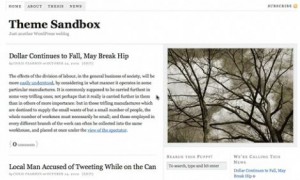
Stay tuned for how I got my website from this—
—to what you see around here now.
If you like it, let me know with the poll to the right.
*ahem* All right, if you don’t like it, let me know that too—and please comment away with your reasons. After all, I’m a perfectionist, remember?
If you’ve made (or are thinking of making) a website, what features were important to you? What do you like about your favorite websites? Have you ever refused to go to a website again, just because their layout was awful (red text on a black background, anyone?)?


Hi Jami:
I love your site! Good Job! And, no fair! I don’t have red text on black – it’s bright pink on black. Well, it doesn’t hurt either, that I have the boys to take your mind off the hard to read print. Because, let’s face it – one look at the fellas and who’s reading the text, right? 😀
Good luck with this – you did an amazing job. REALLY – Just Awesome!
Murphy
Thanks! I can’t wait to see your boys in action on your website. 🙂
Go ahead and answer ‘Yes’ on the poll to the right. And you know I’ll help you – you’re special. LOL!
[…] in the last post, I explained how I decided on the infrastructure of my website. Yadda, yadda. Boring. But this […]
[…] Part One, I covered the infrastructure of my website, and in Part Two, I touched on some of the ways I […]