Formatting: From Manuscript to a Print Book with MS Word
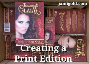
This past weekend I shared a photo on Facebook of my box of print books for Treasured Claim. Yay! There’s nothing like being able to hold your book in your hands to make this “being published” thing feel real. *smile*
I love how my print edition turned out, and since I did it myself, I figured I’d share a few pointers and highlight a few potential problems. I’m too much of a newbie to write up The Perfectionist’s Guide to Print Formatting for those of us self-publishing, but maybe this will be a good start.
As I’ve written about before, we can practice print publishing with CreateSpace. So even if we’re not ready for print publishing yet, it doesn’t hurt to think about these issues in advance. My previous experimenting helped me finish print formatting my entire book in half a day (and that’s with me being nitpicky about everything in this post).
Print Formatting vs. Ebook Formatting
Many indie authors hand off their ebook formatting to someone else because of the technical issues, such as HTML coding, etc. However, many of those same authors (including me) decide that print formatting might be something they can handle. Even the highly successful Hugh Howey likes doing his own print formatting.
Ebook formatting—aside from the technical nature—is relatively straightforward. It doesn’t require us to decide on a font or font size. It doesn’t require us to worry about hyphenation or come up with a policy for how to handle widows and orphans. It doesn’t require us to follow the different header or footer rules.
Print formatting requires countless detail-oriented decisions, and for that reason alone, we might want to take control if we self-publish. If we leave those decisions up to someone else, they may make decisions different from how we would. Also, most of us won’t sell many print copies, and anything we can do to save money helps to make offering a print version a no-brainer.
Obviously, not all self-publishers are as much of a perfectionist control-freak as I am that they’d care about these little details. *smile* But if we learn the basics of print formatting, we’ll know which of these decisions do matter to us, and we might be able to make sure we get what we want, no matter who does our formatting.
8 Decision Steps for Print Formatting in MS Word
Note: These steps assume that our manuscript is in Microsoft Word and that we’re going to be doing our formatting in MS Word as well. So maybe our first decision is figuring out what programs we want to use.
Personally, I draft in Scrivener and export to MS Word for editing and formatting. Others complete their editing steps—and even their formatting steps—within Scrivener. Still others format within Adobe InDesign.
There’s no wrong answer, only what works for us. I know MS Word inside and out, so formatting in Word works for me.
Each decision step will affect the layout of our book in the later steps. For example, if we change our mind about our font or margins after we started dealing with nitpicky things, everything we did to fix issues will need to be redone. So it’s best to follow these steps in order:
-
Decide on the Physical Size of Our Book:
The print-on-demand options for indie authors will generally produce what are called trade paperback sizes. Trade paperbacks are larger than the mass-market paperbacks that many of us are used to. From what I’ve seen, the most commonly used page dimensions for trade paperbacks are 6″ x 9″, 5 1/2″ x 8 1/2″, and 5″ x 8″.
Tip: The larger the page size, the more words we can fit on a page. The more words on each page, the fewer pages our formatted book will be. The fewer pages in our book, the cheaper it will cost to print it. This results in cheaper “author” copies and means we can either charge less or take a larger royalty.
Tip: Handle paperback books of these different sizes to test the feel of each. Personally, I found the 6″ x 9″ size too floppy, so I went with the next-largest 5 1/2″ x 8 1/2″ size, but this is a “your preference may vary” choice. -
Decide on the Template to Use:
I recommend using an MS Word template, just so the basic formatting settings are already in place. The print-on-demand arm of Amazon, CreateSpace, offers templates for free. The tireless Derek Murphy of CreativIndie offers free MS Word templates as well.
Joel Friedlander sells templates with additional formatting options such as font and spacing already selected and the header and footer setting for front and backmatter already fixed. Joel’s new Pulp template is even designed to maximize the number of words on a page.
Tip: Download the template for the physical size you decided on in Step 1. (If you download the wrong size, the template settings won’t help.)
Tip: If you’re comfortable with MS Word, you’ll easily be able to customize the look of any template. I started with Joel’s Flourish template (image on the left) and modified everything but the page size to make the interior how I wanted it (right). (Note: Newsletter readers might need to visit my post to see the images.)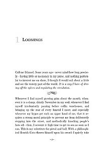
-
Decide on the Font Face and Size:
Click on an MS Word template to open a document with those settings. We may think the font size is too small, the lines are too squished together, or the font face is not readable enough. To make that decision, we probably want to copy a chapter or two of our story into the template document and experiment.
Tip: Readability will usually be our primary goal. Print out a page or two to check for readability of the font itself, the font size, and the line spacing. Settings that increase the number of words per page won’t help if the readability goes down.
Tip: Cut out a printed page to size and insert into a book of the same size to get a hands-on feel for what the settings will look like when printed.
Tip: We’ll usually want to avoid using Times New Roman (that font can give our book a newbie look). We also have to make sure we have the proper licensing rights to use our chosen font. Some fonts that come with MS Word are safe to use with print books, but we’d always want to double check, as the licenses for commercial use could be separate. -
Decide on the Paragraph Settings to Use:
With our sample chapters, we can also try out different paragraph settings. In MS Word, the Paragraph settings determine paragraph indents, widow and orphan control, and hyphenation. Most fiction books will indent every paragraph except the first paragraph of each chapter and scene.
Tip: Widows and orphans are the lonely lines by themselves at the top and bottom of pages when the rest of the paragraph is on the other page. There are two camps of believers in how to handle these. Some hate widows and orphans and work to eliminate them even if pages end up with different numbers of lines per page. Others hate pages that don’t line up and don’t worry about widows and orphans. Decide which camp you fall into and check the appropriate boxes in the Paragraph settings (unless you want to fix them manually (see Step 8)).
Tip: MS Word can automatically hyphenate words. In justified text (even spacing on both sides), some lines might look too spread out if words aren’t hyphenated. However, some hate the look of hyphens, so we again have to decide on which camp we fall into and mark the appropriate checkboxes. -
Decide on the Styles to Use:
A guest post here a couple of years ago from the wonderful Jordan McCollum discussed how to use styles in MS Word, so I won’t cover the information again. However, once we’ve decided on the character and paragraph settings we like, we can set our styles to match.
We might have styles for chapter headings, chapter body, chapter body first paragraphs (with no indent), copyright page, header and footer, frontmatter and backmatter pages, etc.
Tip: We can either create new styles with the settings we want, or we can update the current style of the paragraph to match the current settings. Styles can include however many settings we want as far as font face, font size, tabs, line spacing, italics, centered or justified, hyphenation, etc.
Tip: Select a paragraph with the settings you like and right click. At the bottom of the right-click menu, highlighting Style will allow us to select Update style or Save As a new style. -
Decide on the Margins and Gutter:
Whatever template we use will have certain margin settings already in place. However, we may think those margins are too big or too small and want to change them.
With print books, we need to pay special attention to the gutter and/or inside margin. The gutter is where the pages of a book attach to the spine. As our books don’t open flat, we have to allow for more space on that inside edge of each page.
Tip: CreateSpace requires certain minimum margins. They won’t accept files with less. Use the sample chapters already pasted in to check for the look, readability, white space around headers and footers, etc. Print out another sample page if desired for a double check.
Tip: Within MS Word, we can verify and/or change these settings from Page Layout>Page Setup. (Note: I’m still on MS Word 2007, and the specifics might be different in other versions.) For any changes, ensure that “Apply to” is set to Whole Document unless you’re trying to change the settings of just one section.- From Page Setup>Paper, we can double check the page size.
- From Page Setup>Layout, we can specify different odd and even headers (such as our name on one side and the book title on the other), ensure our chapter openings don’t display headers (that’s a newbie mistake), and set the vertical placement of our headers and footers.
- From Page Setup>Margins, we can set our Multiple Pages to Mirror Margins, change our margins, and adjust the inside margin or the gutter setting to accommodate the spine bend. With Mirror Margins, either the Inside Margin or the Gutter setting can be used to add the necessary space for the spine curve.
Bonus Tip: At this point, we can Save As and select Word Template to save all our modifications. Then in the future, we can click on this template to start new documents for print formatting with these settings. -
Decide on the Special Formatting for Our Book
At this point, we can copy and paste in our whole book. If we’ve done our job right with styles, we can select the body of our book and set it to the style we want. Then we’d just need to make fixes on the exceptions. Exceptions would include chapter headings, scene or chapter first paragraphs, etc.
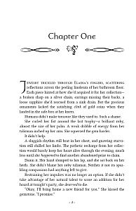
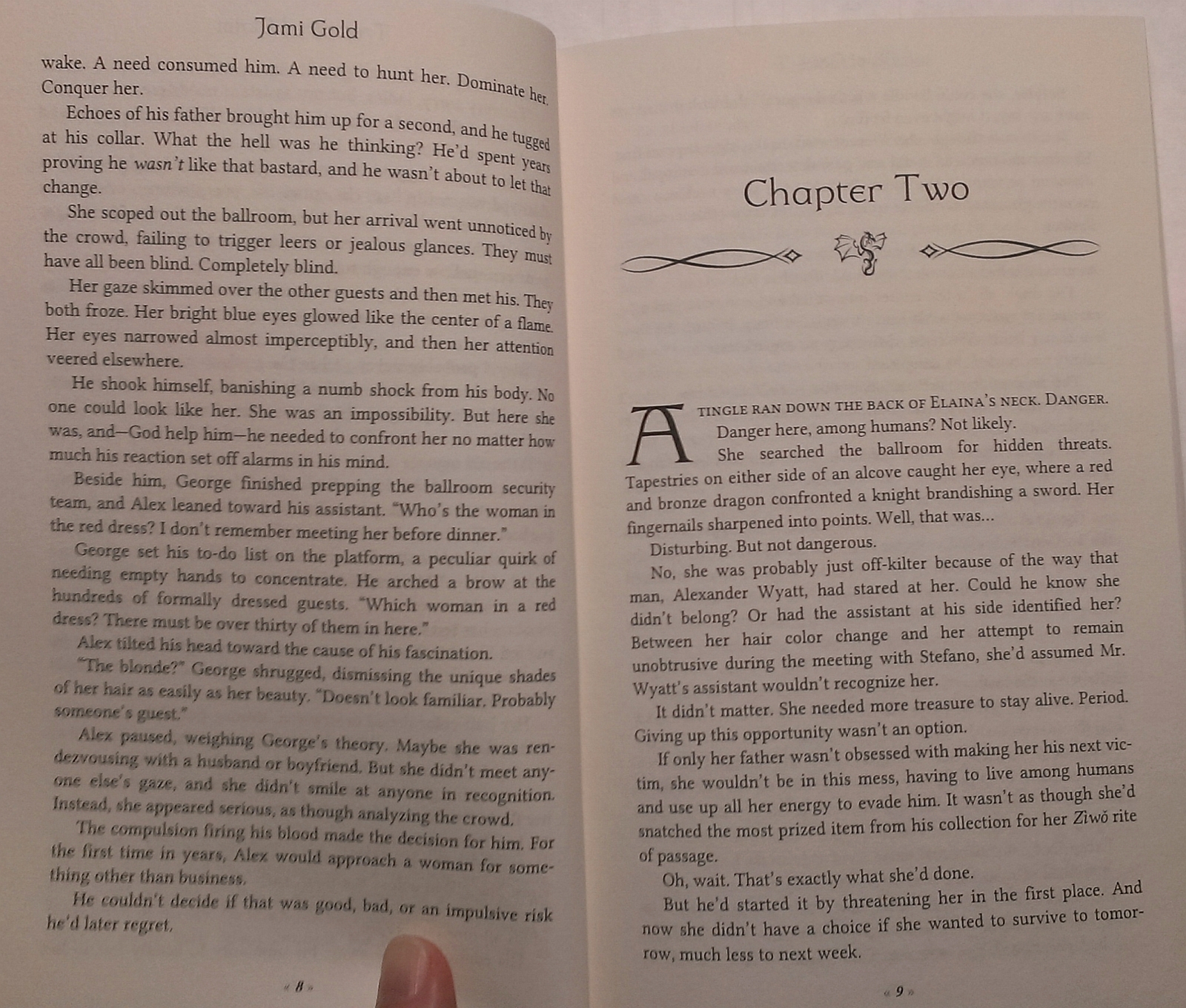
Tip: Common special formatting touches include chapter heading fonts and images, a dropped capital letter on the first letter of a chapter (Insert>Drop Cap), small caps on the first few words or the first line of each scene, images for scene breaks, and a different font face, size, or margins for special inserts (such as if our story includes text from a newspaper article, handwritten note, etc.).
Tip: Styles can sometimes remove the italics from our story. Compare to the original manuscript to find missing formatting and fix.
Tip: If we include images at chapter openings or scene breaks, ensure they’re saved at the exact size needed at 300DPI and insert each image separately (no copy/paste). -
Decide How Nitpicky We Want to Be
There are countless nitpicky decisions we can make from this point. Some may care about these details, but many won’t. We may also decide that some “rules” no longer apply. Here are a few nitpicky decisions I ran across during my formatting:
- Many book designers state that only newbies would have a chapter starting on the left page. However, in my check of books from multiple traditional publishers in my genre and related genres, I found zero books that used a blank page on the left and forced chapters to start on the right.
Is that “rule” no longer relevant that even traditional publishers are ignoring it? Is it only for hardcovers? Certain genres? I don’t know, but I decided not to skip pages, as I saw no reason to pay for blank pages when I found no evidence they were needed. - If we use small caps on the first line of scenes, we may tweak character spacing or hyphenation to ensure a hyphen doesn’t leave a word half small-capped and half not.
- If the last line of a paragraph contains only a partial word due to hyphenation, we may turn off hyphens for that paragraph or change character spacing to eliminate the short line.
- If the last word of a page is hyphenated to the next page, we may make hyphenation or character spacing adjustments to eliminate that hyphen (so the reader doesn’t have to hold the beginning of a word in their head as they turn the page).
- If we don’t like widows or orphans but want to fix them manually to keep the lines per page as consistent as possible, we may want to tweak character spacing, hyphenation, or paragraph breaks to get the effect we want.
- If the spacing of a paragraph is weird due to justification, we may change character spacing or turn on hyphenation for that one paragraph.
- If scene or chapter breaks fall too close to a page break, we may want to tweak hyphenation, character spacing, or paragraph breaks to fix. For example, I made sure scene breaks fell 2 or more lines from the top or bottom of a page and that the last page of each chapter included at least 4 lines. I don’t mind widows and orphans, but these lonely lines bug me. *smile*
- Many book designers state that only newbies would have a chapter starting on the left page. However, in my check of books from multiple traditional publishers in my genre and related genres, I found zero books that used a blank page on the left and forced chapters to start on the right.
There’s no “one right” answer for many of these decisions. There are several appropriate page sizes, margin sizes, etc. There are probably hundreds of readable book-style fonts. And I’ve seen traditional publishers break every “rule” about chapter starts and widows and orphans.
Many of these choices come down to what we want for our book. Only we can decide how much we care and which way we want to go. Hopefully, this list gives us ideas about our choices so we can decide the right approach for us. *smile*
Ta-da! Save As or Print as a PDF to upload to CreateSpace, and a finished book might be just half a day (and a print cover and the CreateSpace and the shipping delay) away from being in our hands. And as I can tell you with Treasured Claim, boy, does it feel good to hold. *smile*
Would you like to format your own print books? Have you tried it before? Did you think about all these decision steps? Does this list help you know what you need to prepare and do? Do you have any questions for me about print formatting?
Pin It
I KNEW there was a reason I’d been putting off formatting for print! *cries* Because of time constraints, I’d ended up doing my copy edits in Sigil (my formatting program) and I had to copy and paste each chapter back into a Word document. I thought that would be the most annoying and time consuming part of it. Now I know it’s not! Sigh. At least I’ve got a list of things to check for. Thanks, Jami!
Hi Amanda,
It’s obviously a long list, with lots of detailed steps, but it’s not impossible by any means. I found I actually enjoyed it. 🙂 Thanks for stopping by!
Here I am, merrily sailing along with my ebook 75% finished.. you come along with this self-publishing plan. I would have been dead by now except that I cannot tie a hangman’s noose. So I discarded the rope.
Formatting is my “Into the valley of death rode the six hundred.”
Tell me it won’t cost my first born to have someone do it for me. Pleassse
Ralph
Hi Ralph,
LOL! No ropes–good plan! 😀
I’ll admit that I love MS Word, so all this stuff was relatively easy for me. If I had more time, I’d offer print formatting as a service, but alas, time is not something I have enough of. Because I’d always planned on doing it myself, I haven’t priced out this service.
If I had to take a guess, I’d say between $75-100 for a normal novel-length book, but I don’t know for sure. Updating an ebook cover to a print cover (adding a spine and back cover) is usually around $75, so if we did our own formatting, the cover would be the main expense (other than ordering and shipping of a proof copy to double check–definitely use the online proofing tools at CreateSpace to eliminate issues before the physical proof expense). I hope that helps! 🙂 Thanks for the comment!
You’re a woman after my own heart, Jami 🙂 I spent (way too much time) nit-picking over my typesetting (I manually kerned most of the lines because I wasn’t happy with how Word did them, and I went through page by page adjusting line height because I wanted facing pages to line up at the bottom – perfectionist much? LOL). But I really enjoyed the whole process. I also know Word backwards and upside down, so it was easy for me to fiddle with the template and get it just the way I wanted it.
Just a note – you wrote:
“Fonts that come with MS Word are generally safe to use with print books”
This is true only for personal use. Monotype Foundry will ding you about $250 for a commercial use licence. That was not in my budget for a font I was ‘meh’ about anyway (Garamond), so I went looking for a free-for-commercial-use font instead. FontSquirrel is a good source.
Hi Elle,
LOL! Impressive! 😀
And thanks for the font insight! Yes, it definitely depends on the font. Some of the fonts I was looking at were developed by Microsoft, so I had those in mind with that comment, but you’re absolutely right that there are more exceptions than fonts that fall into that category. Like you, I went with a font I could get a commercial license for. Thanks for the correction! 🙂
Not much to say this time, but that I’m relieved that all the Chinese novels I peered at on my shelf do indent the first line of their first paragraphs of chapters. Thank goodness because my story seriously has over 200 chapters now…O_O Lol for the always start your chapters on the right side (odd pages) thing, I followed that too, until I realized that the Chinese martial arts novels (kind of the genre I’m writing in) I was reading started their chapters on whichever side happened to be the next side, lol. They were traditionally published too, so I guess they’re like the books you mentioned that didn’t have this “start chapters on odd pages only” style. For finding font permissions, I actually didn’t realize that some fonts already installed in MS Word might not allow you to use them in self-publishing books. Constantia is probably my favorite font ever (love it!), and I used it for my first published book. I was quite confused about the license, and I read around at the CreateSpace forum: https://www.createspace.com/en/community/message/247517 , and at myfonts: https://www.myfonts.com/fonts/ascender/constantia/licensing.html ; and also the EULA document for Constantia use in desktop workstations: https://www.myfonts.com/viewlicense?lid=1444 . Oh my gosh I had to keep rereading them to understand. Well what I gather is that I’m free to use Constantia in my CreateSpace print books, as I (at least not to my memory) didn’t embed the font into my PDF file. I didn’t even know what “embedding fonts into PDFs” meant… — Read More »
Hi Serena, LOL! I love the Constantia font too! When I’m doing a final read through and want to feel like I have fresh eyes for looking at the manuscript, I often change the Times New Roman to Constantia. 🙂 What I found was that printed, though, that font had too heavy of a look, so I never got as far as looking into its licensing for print books. That’s a good point about the difference for licensing for ebooks vs. print. The embedding issue refers to the fact that when a font is embedded in an ebook, it’s meant to “teach” the ereader device how to display that font. However, to do that teaching, the entire font file has to be included, which means that embedding in an ebook is essentially sharing–or distributing–that font file for free. So fonts embedded in ebooks have to be free for commercial use and free for distribution. Those are two different licensing ideas. I have one embedded font in my ebook, just for the chapter titles. Many ereader devices ignore the instructions (or can’t “learn”), but it looks nice for the ones that can handle it. LOL! You’re right though that it wouldn’t make sense to embed for the body text of an ereader, as readers often like specifying the body font or get used to the default font. Embedding in a PDF is trickier. CreateSpace has been known to yell about fonts that aren’t embedded. However, obviously, the end customers won’t receive… — Read More »
Constantia is not free for commercial use. A quick check shows a commercial licence costs $120 for the four font formats (i.e., regular, bold, italic, and bold-italic).
Have a look at “Lora” instead – it has some similar styling that you might like, with the bonus that it looks as nice in print as it does on your computer screen. http://www.fontsquirrel.com/fonts/lora
(And, yeah, don’t bother to enforce the font settings of an e-book – readers will just override it or get annoyed with you if they can’t.)
Hi Elle,
Thanks for sharing that insight and advice! 🙂 I did buy the rights to the fonts I use for chapter titles and book titles, but if I remember correctly, all those I use for the print body were free for commercial use. I just checked, and I already have Lora, but I don’t think I’ve used it before. LOL! Thanks again!
Hi Jami and Elle,
Ooh Lora. Thanks for the tip!
Yeah I’d have to be especially careful if I’m embedding fonts onto a PDF. Yikes that it’d be like sharing a font file. D:
Yay that the Photoshop thing will work!! I’d be heartbroken if it didn’t, haha.
Thanks to my other commenters for the help! 🙂 And I updated the post to make it clear that commercial use licenses aren’t a given for any font.
Thank you, this sums it up really well! I have both tried Lulu and CreateSpace for print editions, and I must say the latter is more complicated, but also far better. Formatting always takes me time and sweat and blood… And then I have to wait up to 3 months for the book to ship from America to Sri Lanka!
Hi Devika,
Yikes! That’s a long lead time. 🙁
I haven’t tried Lulu, so I’m not sure how those compare. I will be trying LightningSource/IngramSpark, but I’m not there yet. LOL!
The first time I worked with CreateSpace (two years ago for my experiment), I struggled for days to fix all the issues they found with the file. This time, because I knew what to fix in advance, my file was error-free and accepted the first time. So I’d say this is an area where experience will eventually make it easier. 🙂 Good luck to you, and thanks for the comment!
When I wrote my first book back in 2012, I was in too much of a hurry to try to make it look fancy. As a result, I wasn’t happy with the outcome (or the story, come to think of it), and have since removed the book from sales. It’s definitely better to put in the work, and hold a hard copy of something you’re proud of. 🙂
Looking forward to getting there with my next book.
Hi Becky,
I’ll keep my fingers crossed that your next time out results in a story you’ll be proud of. 🙂 Thanks for stopping by!
This is wonderful! Thank you.
I am having trouble formatting the headers/footers/page numbers. Any advice, how to guides for that?
Thanks again.
Hi Kirsten, I understand. 🙂 There are several tricky aspects about headers and footers: we generally don’t want headers or footers in front or backmatter we don’t want headers on chapter openings we might want different even and odd headings for author name and title page numbering would usually start on page one of the actual story For many of these, the first step is to ensure that we’re using Section Breaks between front matter sections, chapters, and backmatter sections. That is, page breaks are fine for within a chapter, but we should use section breaks between chapters. Ditto for between title page and copyright page and dedication page, etc. The reason for this is that we can set within Page Setup that the first page of each section gets different headers/footers. Bingo, we can delete the header on a chapter opening without problems. From section to section, when our cursor is in the header/footer area, we can link or unlink the headers/footers to the previous section. So if we have headers and footers deleted for the title page, we can have the next few front matter sections linked, and they’ll be clean as well. Then at chapter one, we’d unlink from the previous section so we can change the rules to include them. Each chapter would then be linked to the previous chapter, so we don’t have to reset the rules each time. Then at the backmatter, we’d unlink again, to delete them. With all the chapters linked, we… — Read More »
YOU ARE AMAZING! <3 Thank you.
You’re welcome, Kirsten! 🙂
Great post!
I actually write all my drafts already formatted in Word from CreateSpace’s template. And, now that my YA series is trad pub, I asked my publisher if I could write my next contracted book in their template, and I got the go ahead.
My editors are used to making edits in the formatted versions now, so it makes things go easily. I LOVE Scrivener, but it adds an extra step for me, so I usually keep everything in Word. And, for the books I DO self-publish, I convert to eBook directly from the formatted paperback version by removing the styles and changing the fonts to Garamond. I’ve also learned how to make an active Table of Contents. My eBooks may not look fancy like others, but they still function the way they’re supposed to, and I haven’t had any complaints from readers. 🙂
For paperback fonts, I love using fontsquirrel.com, which has a ton of commercial fonts free to use. It is quite a job to do it all yourself, but I enjoy all the little things about book design now. I’m actually working on one of my client’s books and formatting it for her to make it print ready.
In my experience, I find that people either love or hate formatting for paperbacks. I have yet to find a client who actually wants me to teach them how to do so; they usually just send me their manuscript and let me do the work. 🙂
Hi Tamar,
I never even thought of that because my editors and beta readers are all used to manuscript format. LOL! But that would be a great idea in some situations, for sure. 🙂 Thanks for sharing your insights and suggestions!
I love how you tweaked your template! Looking forward to designing my book for print – it’s a 112k historical – and have looked at many books for layout ideas. I like fontsquirrel for its freebies, another place to look is fontspring. You have to pay for fonts but sometimes there are freebies. And I forgot about licensing so must check to see if the fonts I want I can actually use (very strict budget here) so thanks for the reminder 🙂 What I am most concerned about is ebook formatting – do I write the code myself as Guido Henkel says to avoid potential device problems or use the easier way of using the filtered html or word docx file into Calibre? Thoughts?
Hi Col,
I haven’t tried doing my own ebook formatting yet, so I’m mostly ignorant on those issues. LOL! I’ve heard that many use Sigil, but I’m not sure of the right flow to get our story from Word into that. Maybe a Google search on “ebook formatting in Sigil” would help?
I’m trying to get my ebook formatter to do a guest post for us, so stay tuned. 😉 Thanks for stopping by!
Believe me, I’ve read everything I can find – hence my confusion 🙂 I just find writing code to be a PITA. Ive done that for a few shorts. I have dl Sigil but not looked closely at it. Looking forward to your ebook formatter’s post. Thanks again.
Hi Col,
I understand HTML and could do ebook formatting, but it hasn’t been worth it for me to take the time to learn yet. So I understand. 🙂
[…] Different publishing paths are increasingly fluid and interconnecting. Jane Friedman examines whether self-publishing is a good springboard to traditional publishing. If you are self-publishing your book, Jami Gold explains how to format from manuscript to print book with MS Word. […]
[…] Gold guides us in the process of formatting a manuscript for printing using MS […]
[…] couple of weeks ago, I talked about how we can offer a print version of our book, even if we’re self-published. I have Treasured Claim available at Amazon through their […]
[…] Formatting: From Manuscript to a Print Book with MS Word This post delves into the 8 decision steps we’ll need to make if we decide to self-publish a print version of our book (includes specific MS Word instructions). […]
[…] that means adding a print version. Sometimes we might re-release several completed books in a bundle. And sometimes we might release […]
I have WORD 2003. Which version would you advise, if I were to switch from 2003? I’m so-so with 2003, but willing to “move up.”
[…] before how we can purchase book interior formatting templates from Book Design Templates (I’ve heavily modified one of these templates for my print books), but free is even better. […]
Wish I’d read this post earlier. I use CreateSpace preformatted template. I plunk my whole ms down on Chapter One. I never even noticed I have headers on the other chapters’ first pages. The preformatted templates only have 10 chapters and I have more. At least I am consistent this way. I start each chapter way down on the page so the header is not all that noticeable. In the future, I’ll keep my books to 10 chapters and insert each chapter in the appropriate place in the template. But, what I would really like to learn is: How do you insert a cute graphic on the first page of each chapter?
Hi June,
I turn on “Show Paragraph Marks” (the backward P-looking symbol) and copy and paste the section break before a chapter heading page through the chapter heading stuff. That should allow you to add as many chapters as you need. 🙂
As for the graphic, that’s a little trickier because CreateSpace is so picky about graphics. You have to start with an image that’s sized exactly as it will fit on the page (don’t let MS Word resize anything) and that’s 300 dpi resolution (if you right-click on an image and look at Properties>Detail –on a PC anyway– you can see the horizontal and vertical resolution). There might be a few settings in MS Word to change too, to prevent it from compressing images, but I changed mine so long ago that I can’t remember the details anymore. Do a Google search, and you can probably find the answers. 🙂 Good luck!
Basically, that worked. I have Libre Office so that may make some difference. I copied the first page of Chapter 10. Then I pasted that where Chapter 11 was to start. I deleted until Chapter 11 was in the right place. I thought it didn’t work because the heading was still there. I made a copy for experimenting and closed the original. After two frustrating hours, I opened the original. Voila! Now the heading was gone, Yay! I sent my ms up to CreateSpace. I think you have to save, close, and reopen.
In case someone with LibreOffice reads this: CreateSpace didn’t like my solution. They said the formatting was wrong. They sent Microsoft Word directions.
Please just give me a idea: just for formatting my printed manuscript of 300 pages, how
Much could it be?
Hi Li,
Since I don’t pay someone to format my print version, I’m not sure. It probably really depends on quality and nitpickiness too.
For example, for $50, you might be able to find someone to do the minimum — create a PDF that will work. To make it pretty, do chapter heading graphics, check for widows/orphans, etc., I’d guess it’d be $100-$300? But like I said, I haven’t paid attention to those prices, so I don’t know.
If you have a Mac, I’d suggest looking at Vellum for an easy formatting option, as I’ve heard lots of good things about them. (They don’t have a PC application, unfortunately.) Good luck!